Graphics
Our visual identity is supported by graphics that derive from the icon. They are clear and simple, yet strong and bold shapes that underline our brand identity's core values of clarity and simplicity.
Shapes#
The shapes are formed by one or multiple diagonal lines that can run in any direction, as illustrated below. We do prefer a rising diagonal, because it symbolizes growth and progression. These shapes may be applied freely and intuitively, but always appropriate within its context.


Shades and gradients#
The shapes may be used in lighter shades of our primary colours (see Colors) or gradients.


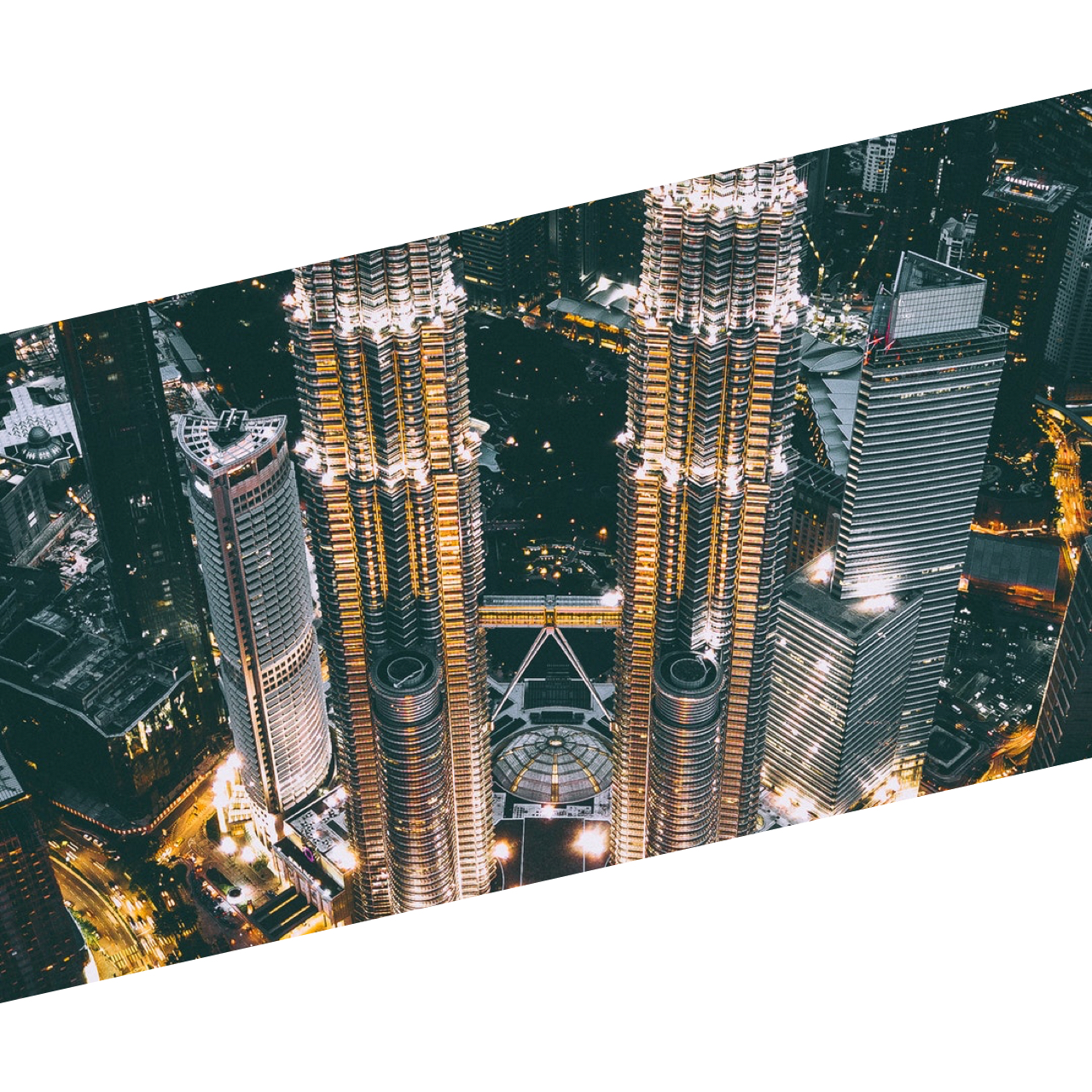
Images#
Images may also be clipped using diagonal lines.


Pictograms#
A pictogram can be a good way to illustrate a certain functionality for example. There are plenty of third party resources that offer quality pictograms. However, to maintain coherence between pictograms, we stress to select stylistically matching pictograms. To maintain coherence with our visual identity, we adjust every pictogram to our primary colors, and add accents in our signature color (see Colors).
